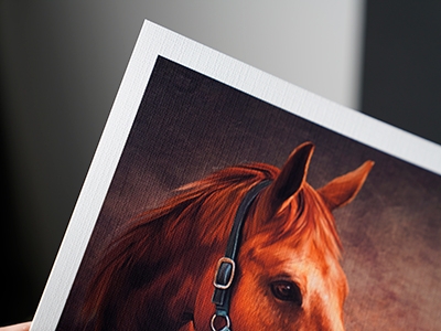
When choosing a paper for a photograph, we usually think about familiar characteristics such as light reflection, colour, weight or brightness. But there is another characteristic capable of changing the image just as dramatically: texture.
With a smooth photo paper, the surface mostly stays out of the way. The photograph itself takes the spotlight. On a textured paper, however, the surface becomes part of the image.
Depending on the paper, that can make a photograph feel softer, more traditional or even slightly painterly. It can complement some photographs beautifully - and distract from others.
So when should you choose a textured matte paper, and when is a smooth surface the better option?
From Artist’s Canvas to Textured Inkjet Paper
Artists have experimented with different painting surfaces for centuries. Canvas became particularly important during the Renaissance, when Venetian painters helped popularise it as an alternative to wooden panels. Its woven structure eventually became so closely associated with painting that today we instinctively connect a visible textile texture with traditional artwork.
Modern printing materials take this idea much further. A photograph no longer has to be printed on a perfectly smooth sheet of photographic paper. Specialised inkjet coatings can be applied to papers with linen-like, cotton, watercolor-inspired and other textured surfaces while still allowing them to reproduce photographs and illustrations.
The goal isn’t necessarily to imitate canvas. Instead, these papers give photographers, artists and designers another creative variable to work with: the physical surface itself.
What Does Texture Actually Do to a Photograph?
A textured surface interacts with both the printed image and the light falling onto it.
Small peaks, valleys and fibres catch light differently from a completely flat surface. As a result, the texture remains slightly visible through the photograph—particularly in lighter areas such as skin, clouds, mist, walls and empty backgrounds. This can give the print a sense of depth and physical presence that doesn’t exist on a screen.
It also changes our perception of sharpness. A good textured inkjet paper can still reproduce excellent detail, but the surface structure competes slightly with extremely fine details. The result can feel less clinical and more organic.
That is often exactly the point.
A portrait, landscape or fine-art photograph may benefit from that additional character. A technical product photograph containing tiny lettering probably won’t.
Think of it this way:
Smooth paper says: look at the photograph.
Textured paper says: look at the object, the photograph has become.
When Does Textured Paper Work Best?
There are no strict rules, but some types of imagery naturally benefit from a textured surface.
Portraits
Texture can give portraits a softer, more handcrafted appearance, particularly when the photograph already has restrained colours, natural lighting or a fine-art style.
For extremely sharp beauty photography or photographs where every pore, hair and fabric detail needs to remain visually precise, a smoother surface is preferable.
Landscapes and Nature
Landscapes are particularly interesting on textured paper.
Clouds, fog, rock, trees, old buildings and natural materials already contain irregular textures of their own. A textured paper can reinforce those qualities and give the image additional depth.
Minimal landscapes with large areas of sky or mist can be especially effective because the paper texture becomes visible inside otherwise quiet areas of the photograph.
Artwork and Illustration Reproductions
Watercolour illustrations, drawings, paintings and digital artwork can gain a convincing physical quality when the texture of the printing surface complements the texture suggested by the original artwork.
Black-and-White Photography
Textured matte papers can also work beautifully with black-and-white photography, particularly for expressive portraits, architecture and landscapes.
Just remember that the texture itself becomes another visual element. If the photograph depends on extremely clean tonal transitions and sharp micro-details.
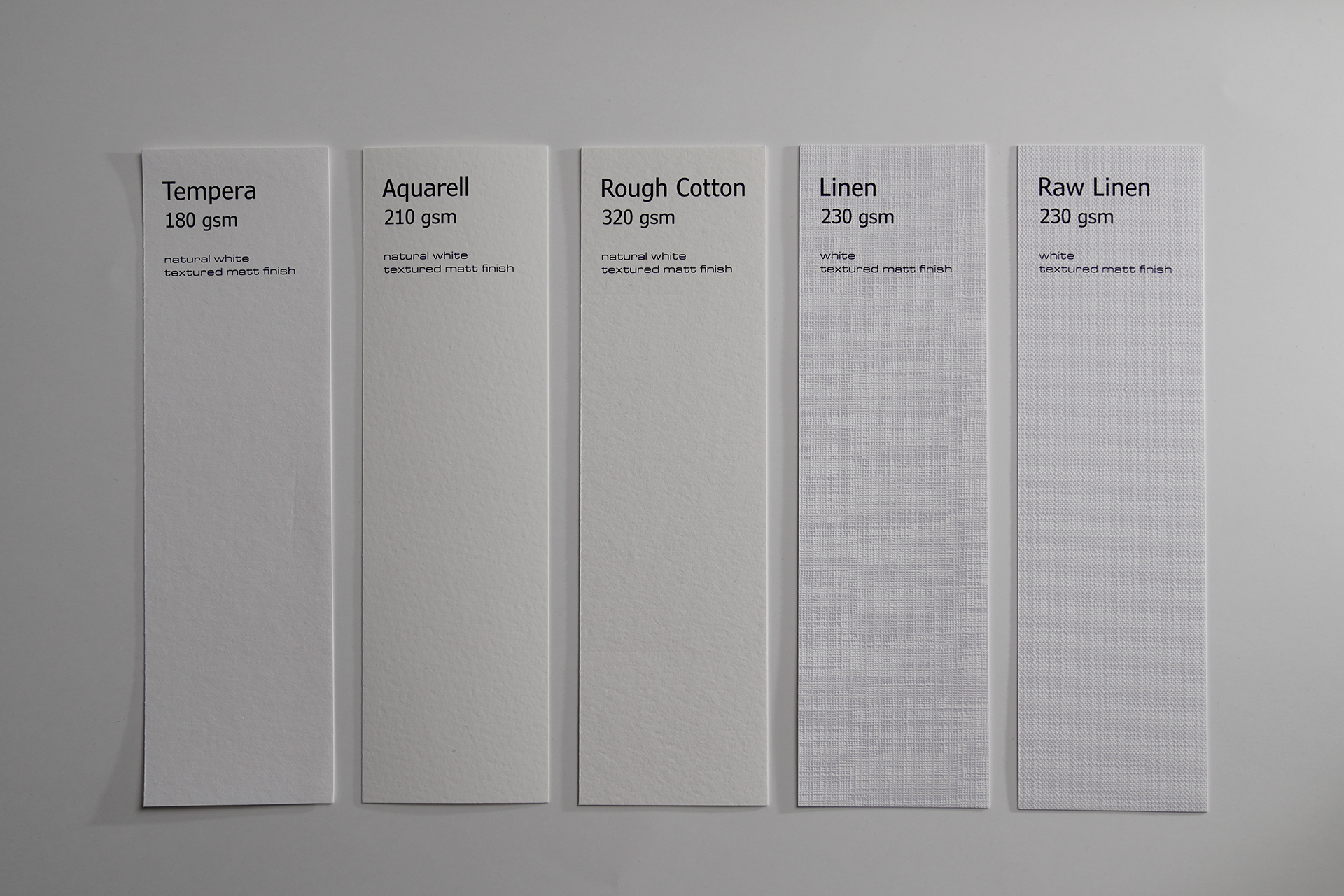
Five Different Textures, Five Different Personalities
Not all textured papers produce the same effect. Even within the matte range, changing the surface can significantly change the personality of the finished print.
Here are five examples from the Katana Craft & Art range.
Linen 230
Linen 230 is a matte inkjet paper with a linen-inspired surface.
Its repeating woven texture introduces a textile-like quality without turning the print into actual canvas. This makes it an interesting middle ground for photographs that need some additional character while remaining recognisably paper prints.
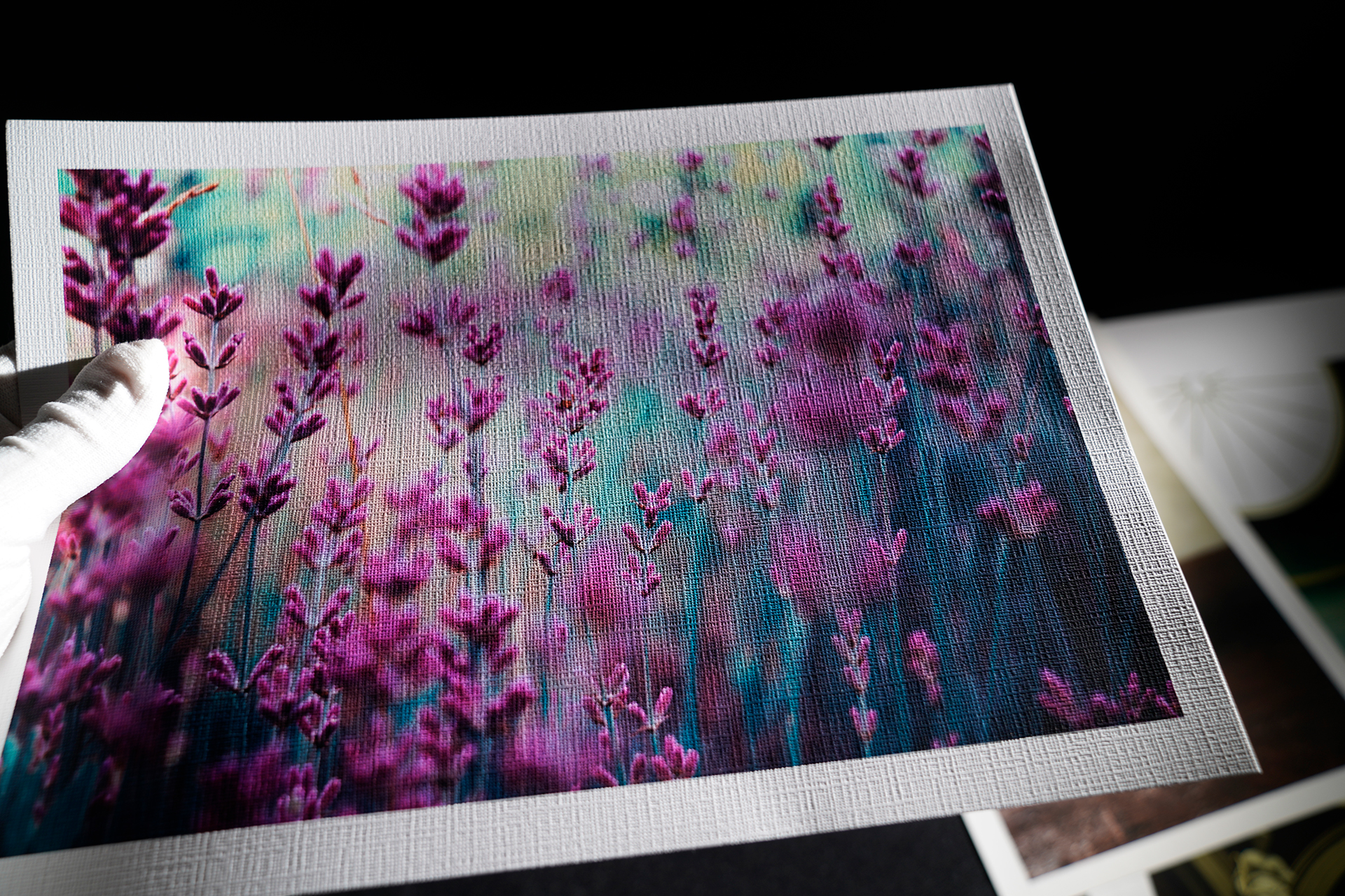
Try it with: portraits, still life, decorative photography, vintage-inspired imagery and illustrations.
Think twice with: images containing very small text or photographs where the texture needs to remain completely invisible.
Raw Linen 230
Raw Linen 230 is also a matte inkjet paper, but its surface has a more pronounced woven character.
Its geometric, almost knitted appearance can become a much more noticeable part of the final image. Rather than disappearing behind the photograph.
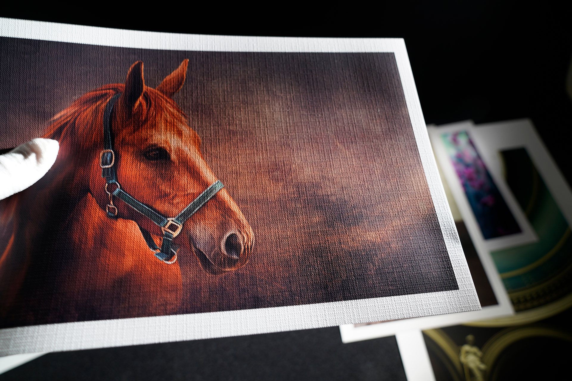
Try it with: expressive portraits, rustic subjects, still life, artwork reproductions, decorative prints and experimental photography.
Think twice with: highly technical images, tiny details or photographs where realistic skin texture is critical.
Tempera 180
At 180 gsm, Tempera is considerably lighter than the heavyweight cotton papers in this group, although being harder on the feel. It has a natural-white matte surface and is designed for photography, illustrations, decorations, cards, invitations, posters, calendars and other creative applications.
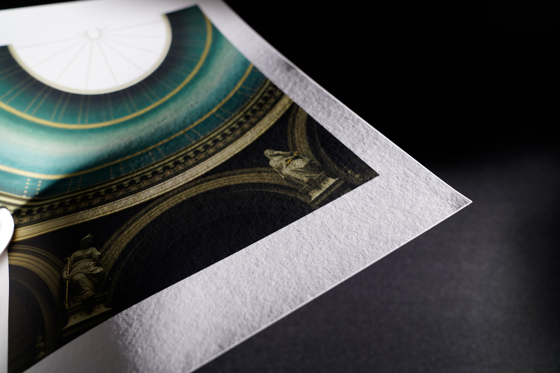
Try it with: decorative prints, illustrations, posters, cards, invitations, calendars and craft projects.
Think twice with: applications where a very heavy, rigid fine-art sheet is part of the desired presentation.
Aquarell 210
Aquarell 210 is a natural-white fine-art paper with a textured matte surface.
Its surface gives prints a character reminiscent of traditional artist papers, making it especially suitable for photographs and artwork that benefit from a softer, more organic presentation.
The natural-white base is also important. Instead of the colder appearance of a very bright photographic white, it can contribute to a warmer, more traditional feel.
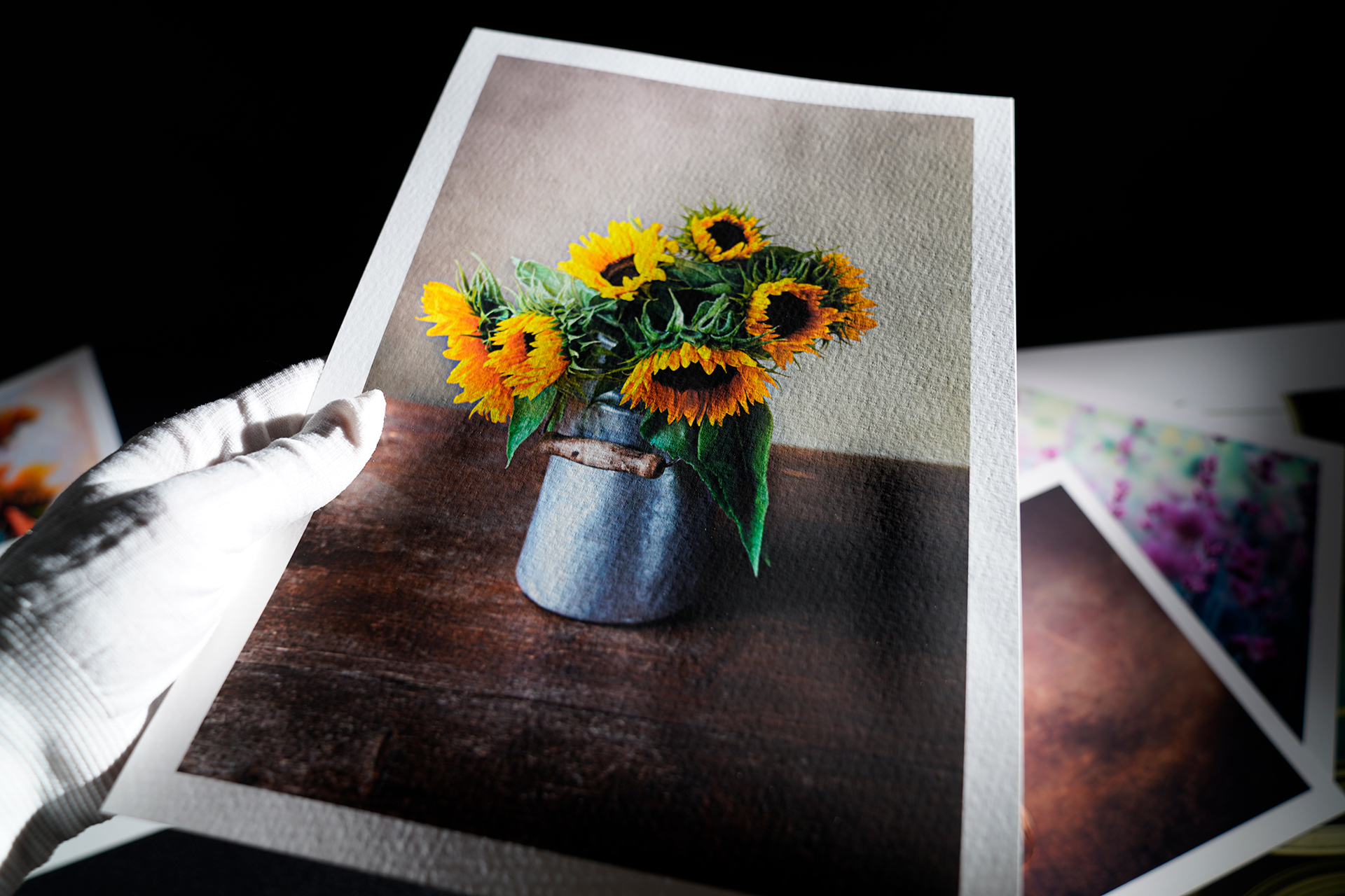
Try it with: landscapes, fine-art portraits, watercolor reproductions, illustrations, muted photography and exhibition prints.
Think twice with: images that depend on an extremely bright white base or an ultra-smooth contemporary appearance.
Rough Cotton 320
This paper takes the idea considerably further.
It is a heavyweight 320 gsm fine-art paper made from 100% cotton, with a natural-white colour and a deliberately rough surface.
The combination of weight, cotton construction and texture gives the finished print much more physical presence. It is particularly suited to work intended to feel like a finished art object rather than an everyday photographic print.
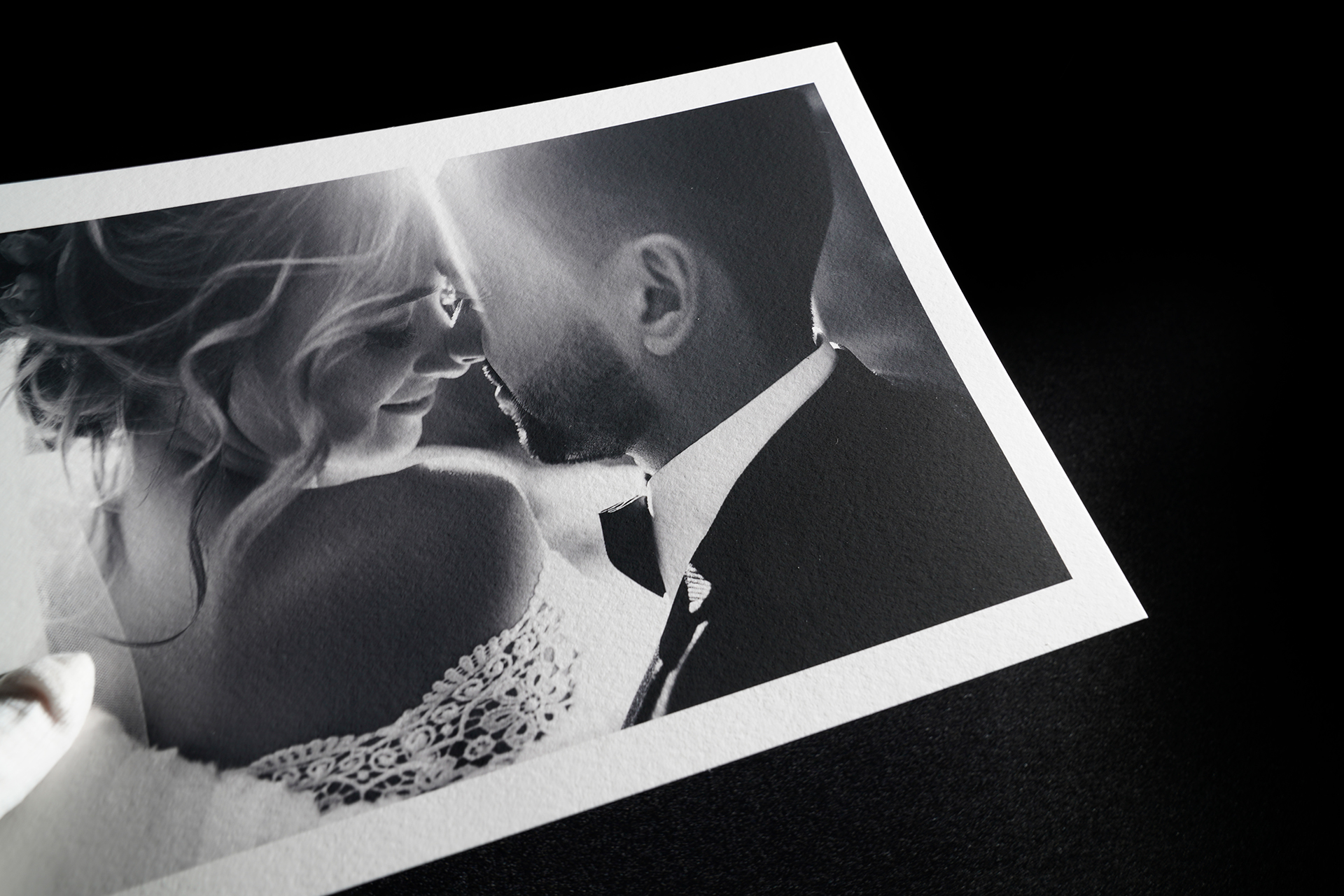
Try it with: exhibition photography, fine-art reproductions, portraits, landscapes and limited-edition prints.
Think twice with: printers that have difficulty feeding very thick media. Always check the printer’s supported paper thickness and feed path before using heavyweight fine-art papers.
Don’t Forget About Crafts
Photography is only one use for textured inkjet papers.
Because the design can be printed first and the sheet worked with afterwards, these papers open up a large range of craft applications:
· greeting cards
· wedding invitations
· menus
· decorative tags
· scrapbook pages
· paper ornaments
· packaging prototypes
· collage
· papercraft
· printed illustrations and cut-outs
Texture Should Be Chosen for the Image, Not Just the Paper
It is easy to pick up a beautifully textured sheet and immediately want to print everything on it.
But the most interesting textured print isn’t necessarily the one with the most dramatic paper.
It is the one where the surface and image make sense together.
A quiet photograph can gain depth from a pronounced texture. A painterly portrait can become more tactile. A watercolor reproduction can feel closer to an original work. At the same time, an extremely detailed photograph may become stronger when printed on a surface that stays completely out of its way.
Neither approach is inherently better.
The important thing is to stop thinking of paper as nothing more than the material that carries the ink.
The paper is part of the photograph.
Post comment